Design

System

tvam-logo-mark
mOBILE app

Tvam Technologies

Bangalore, India.

Tvam is an all-in-one app
that helps you make payments, get loans, buy insurance, and even talk to doctors.

BACKGROUND

Our CEO and investors had just finalized a big brand change…from a blue logo to an orange one.

Why:

The old blue design felt outdated and didn’t reflect the brand’s new energy or growth.
The new orange identity stood for hope, empowerment, and confidence…qualities we wanted our product to reflect.

My Role:

I led this with a team of four designers. Together, we had to redesign everything…not just colors, but the entire system behind it.

1

months to redesign the foundation.

1 + My team

Sr. UXD: Hareesh K

Sr. UXD: Bidisha Dutta
UXD: Ankith L
Illustrator: Shivani Rai

Sr. UI/UX Designer

Suraj Nath

My role in the project

UX Audit & Research

100%

UI Design

50%

Collaboration & Handoff

85%
* * From blue to orange
* * Tvam’s new design system journey
* * From blue to orange
* * Tvam’s new design system journey

The blue audit

Before we could start painting everything orange, we needed to understand what was broken in the blue version.

So, we started with design audit…going through every module, screen, and component.

Core Challenge

Tvam’s product had grown through multiple teams and started to feel like three different apps in one.

Before us, the designs were outsourced to an external agency, with several designers working on different modules.


Because of this, there was no single source of truth or design direction. Each module had its own look and behavior…layouts, colors, and icons didn’t match. This inconsistency made the product confusing for users and difficult for developers and testers to maintain.

careers-icon3
careers-icon1
careers-icon2

For Users

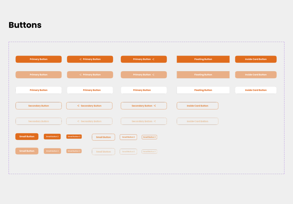
Jumping between modules felt like using different apps. Buttons moved, filters behaved differently.

For Engineers & Testers

They had to rebuild and test UI components every time, creating massive technical debt and slowing down releases.

For Support Team

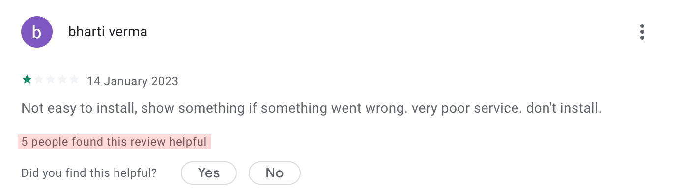
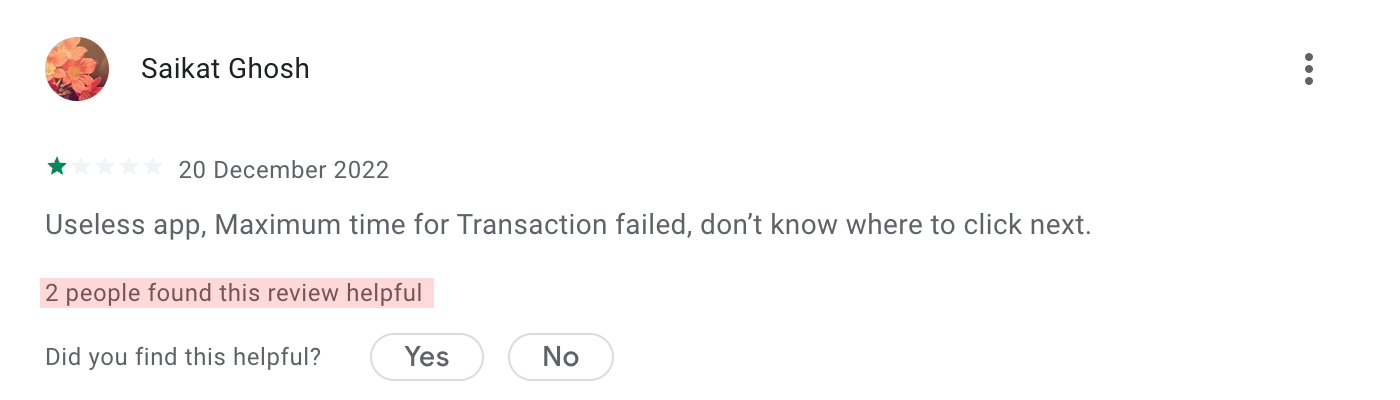
Support was overwhelmed with tickets and calls about confusing interfaces. Many “issues” weren’t bugs…just inconsistent UX.

What we found on play store

Why this really mattered

1.

around 30–40% of support issues were just because of confusing UI.

2.

Developers were spending 1–2 extra days every sprint rebuilding the same components

3.

Usability tests showed users taking 2× longer to complete common tasks.

The Mission

So, we decided to fix this at the root by creating Tvam’s first Design System.
A single shared space where our team could store and reuse every design element…buttons, colors, fonts, layouts, and patterns.

Improving the design team from within

From Adobe to Figma

Since all our old designs were done in Adobe XD, it was the right time to fix how our design team worked internally too.


In Adobe XD, only one person could open a file at a time. Designers had to wait, versions got mixed up, and even small changes took much longer than needed.


So before we started fixing Tvam’s design problems, I decided to move the whole team to Figma.


With Figma, everyone could work in the same file together, leave comments instantly, see changes live, and build components as a team instead of working separately.

How we put everything into action

Redesigning the entire app from the ground up.

Foundations

1. Foundations

Setting the base right

After checking everything, listening to everyone’s feedback, and reviewing the old screens, we finally understood what needed to be fixed. Now it was time to start building the solution.

Setting up UI kit in Figma

Our first step was to create a single place where every design element would live.
This became the Tvam UI Kit, our shared Figma library.

We made sure every component was clean, reusable, and flexible, so developers could use it without guesswork.

UI Review

2. UI Review

Reviewing the core library

Building and testing components

Instead of jumping straight into final screens, we built components first…and tested them early.

Every improvement was added back into the UI Kit, making it stronger each week.

Dev Alignment

3. Developers on board

Getting everyone in sync

Getting developers on board

One of the important parts was helping developers adopt the new UI Kit.

At first, it took time for devs to adjust to the new system, but once they understood the rules, things became smoother.


We also reduced:

Redesign

4. Redesign

Rebuilding every screen

Full app redesign

Once the components were ready, we redesigned every part of the app using the UI Kit.

The new screens felt clean, simple, and aligned…something Tvam never had before.

Final
Screens

11
bboysun7
22
bboysun7
33
bboysun7
Tvam UI kit
Tvam UI kit
Tvam UI kit
Tvam UI kit
Tvam UI kit
Tvam UI kit
Tvam UI kit
Tvam UI kit
Tvam UI kit
Tvam UI kit
Tvam UI kit
Tvam UI kit
Tvam UI kit
Tvam UI kit
Tvam UI kit
Tvam UI kit
Tvam UI kit
Tvam UI kit
Tvam UI kit
Tvam UI kit
Tvam UI kit
Tvam UI kit
Tvam UI kit
Tvam UI kit
Tvam UI kit
Tvam UI kit
Tvam UI kit
Tvam UI kit
Tvam UI kit
Tvam UI kit
Tvam Design System
Tvam Design System
Tvam Design System
Tvam Design System
Tvam Design System
Tvam Design System